NZ Covid
How I closed a 1.4 million user gap during the COVID-19 pandemic
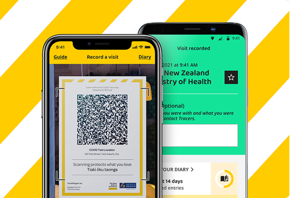
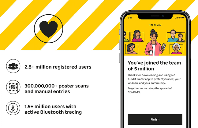
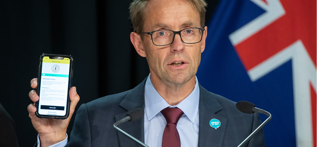
2.7 million New Zealanders downloaded the Covid Tracer app. Only 1.3 million had Bluetooth Tracing enabled, which allowed frictionless contact tracing that would kerb the spread. I diagnosed it as a UX failure and redesigned the experience to close that gap.
Role_
Senior Product Designer
Scope_
Strategy·UX/UI·Research
Date_
20’ – 21’
Recognition_
Best Design Award, Gold
Recognition_
Open Source Awards 2021
Recognition_
GOOD Design Awards 2021
01
Problem
2.7M
Unique app installs
95%
Devices capable of BT Tracing
49%
Users enabled BT tracing
Bluetooth Tracing was opt-in, invisible, and poorly explained. Users didn’t understand what it did, couldn’t see whether it was working, and had no compelling reason to turn it on. The onboarding flow asked for trust before establishing it. That was the failure to fix.
02
Approach
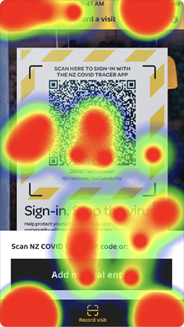
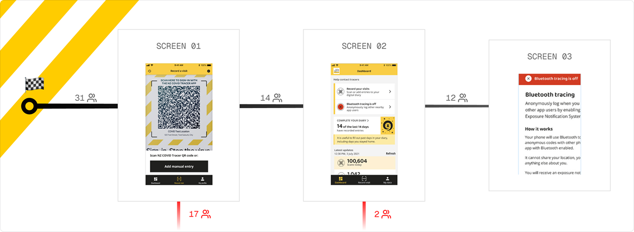
Through a heuristic audit and early benchmarking, I found the drop-off wasn’t random. Two distinct failures were responsible for nearly half of eligible users not enabling a feature that would protect their community.
18%
Mislick rate on primary CTA
38.7%
Avg task success rate
47
Usability score
55%
Users drop off at screen 1
Blocker 1
The app asked for trust before earning it
Onboarding used technical language, no clear calls to action, and frontloaded too much information. Users arrived at the BT screen without understanding what they were being asked to do — or why it mattered.
Blocker 2
BT status was invisible once you were in the app
Existing users had no way to tell if Bluetooth Tracing was active. There was no persistent indicator, no reminder, and the action to enable it relied on users remembering where to find it — not on the app surfacing it.
03
Design brief
The discovery findings translated into a single HMW and two testable hypotheses with defined success metrics — set before any design decisions were made.
How might we
improve Bluetooth Tracing feature acquisition for both new and existing users?
H1
We believe
increasing the visual affordance of Bluetooth Tracing will drive acquisition
Because
users need a clear, persistent cue — not a buried setting they have to remember to find.
Success metric
BT daily active users grow by 30% within one month of launch.
H2
We believe
improving how Contact Tracing is explained will lift acquisition across both new and existing users
Because
users will understand what they’re enabling — and why it’s worth it.
Success metric
Daily BT active devices grow while poster scans remain stable or also increase.
04
Design
Finding
Design decision
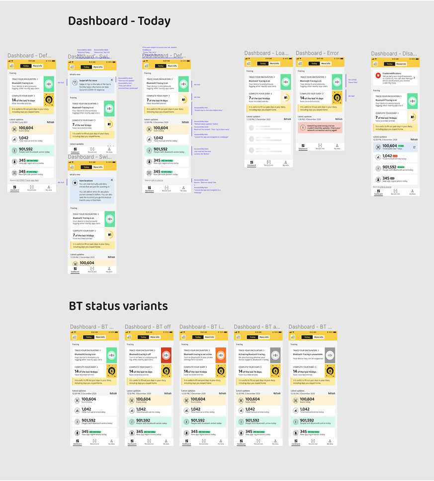
No system visibility — users couldn’t tell if BT was active
↓→
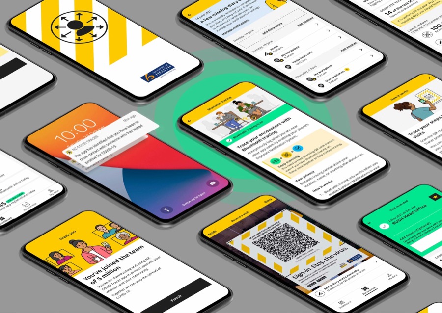
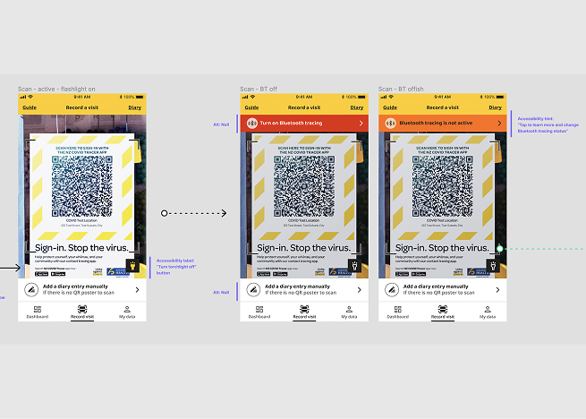
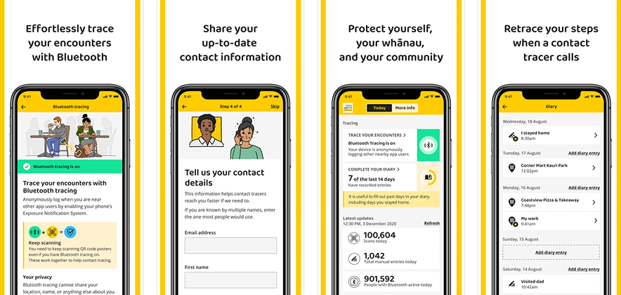
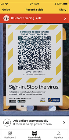
Persistent BT status indicator on dashboard, always visible regardless of screen state
Action relied on memory rather than choice or clear prompt
↓→
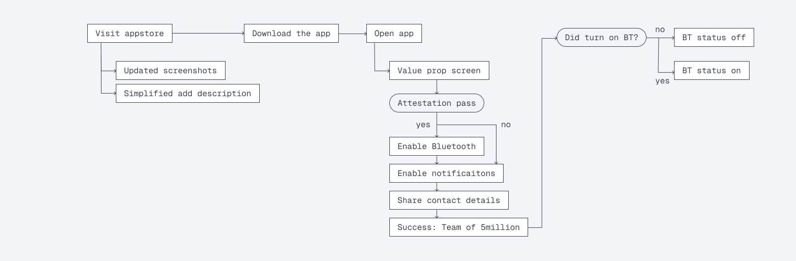
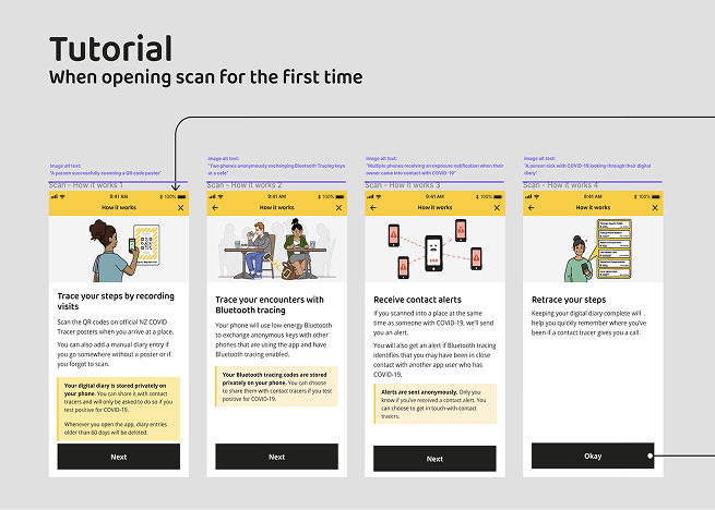
Single action per onboarding screen — one decision at a time, no competing CTAs
Too much information upfront, overloading users before trust established
↓→
Value prop screen leads with benefit (“Trace your encounters”), mechanics collapsed below fold
Landing page lacked focus — 38.7% success rate, 17/31 dropped at screen 1
↓→
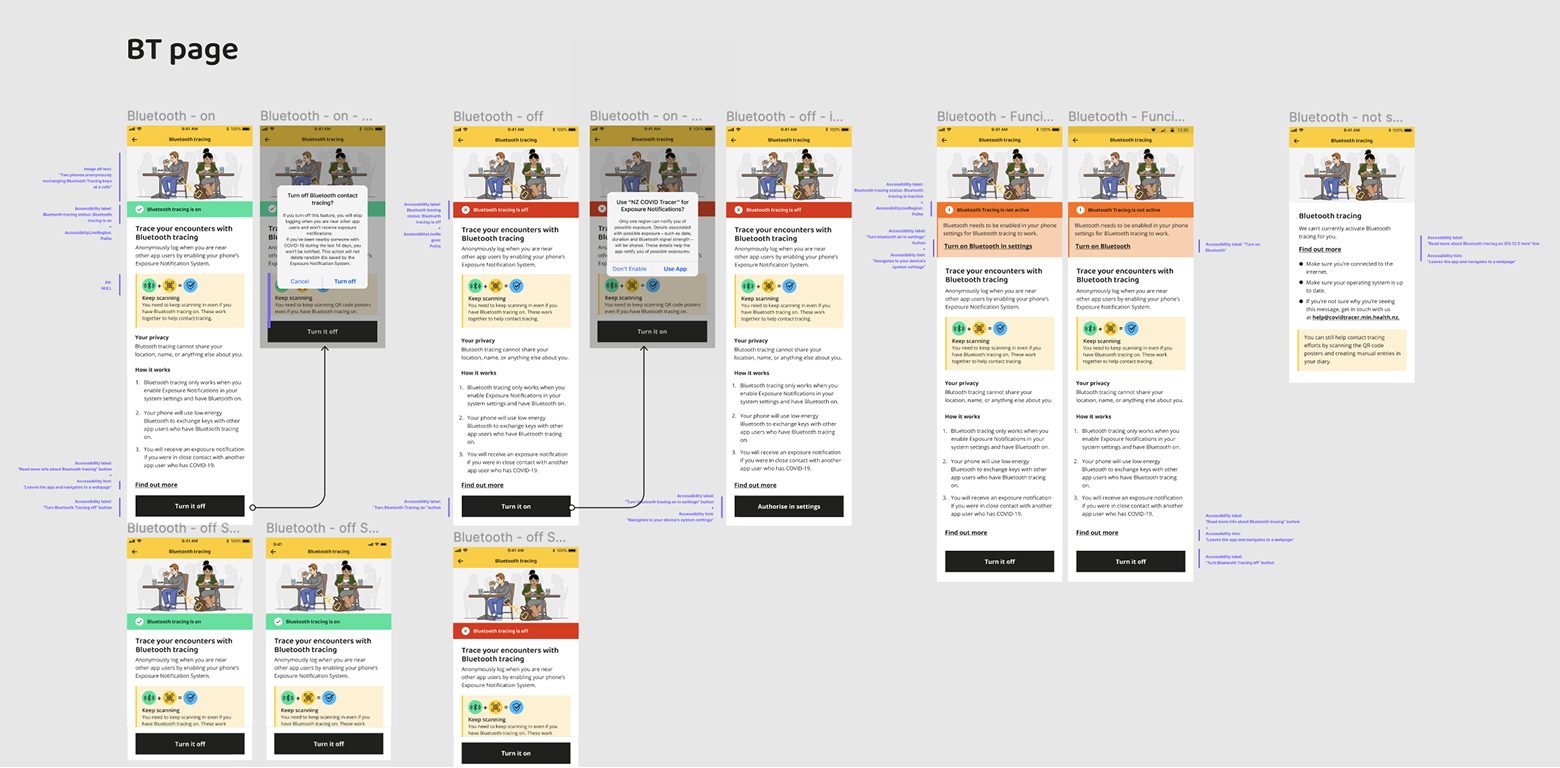
Redesigned to single primary CTA with supporting context collapsed — BT enable action unmissable
No path for users who already had BT on — flow assumed new state
↓→
Separate flows for new users and existing users with BT already enabled — context-aware entry
05
Validation
Two rounds. Each one answered a specific question.
I ran two rounds of user testing against the redesign. Each round had a clear “therefore” — findings fed directly into the next iteration rather than being logged and filed.
18% → 5.3%
Mislick rate reduction
55% → 12%
Drop off reduction at step 1
38% → 92%
Task success
47 → 81
Usability score improvement
06
Outcome
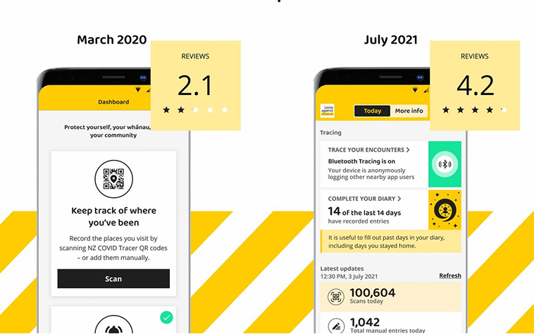
Both hypotheses validated within one month of launch. While at the end of my tenure on the project the app rating score doubled.
1,494,077
Daily active BT devices
2,006,506
Mislick rate reduction
618,344
Daily poster scans
672,605
26% growth
07
Journey
Audit & Benchmark
Heuristic evaluation and baseline usability test across onboarding and in-app BT surfaces. Identified six critical failures.
Design
Collaborative ideation with PO, design, dev, and MoH PO. Every decision mapped to a finding.
Test
Two rounds of user testing. Each with a specific question and a clear “therefore.”
Ship
Delivered over two agile sprints with Ministry of Health approval at each stage.