Basis
How I built a product strategy when there was no product owner to hand it to me
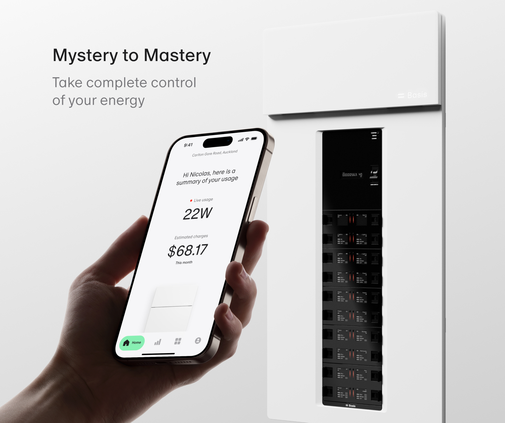
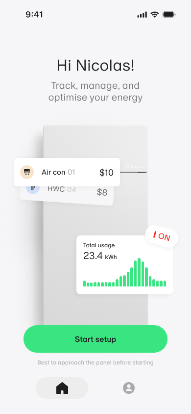
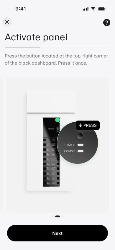
Basis built smart electrical hardware for NZ homes. They knew they needed a companion app, but had no PO, no product brief, and no defined direction. I stepped in to own the strategy, run the research, and design an app that reduced household energy bills by 10% in the first pilot.
Role_
Senior Product Designer
Scope_
Product strategy · UX/UI · Research
Date_
23’ – 24’
Recognition_
Best Design Award, Gold
01
Problem
A hardware product and a blank slate.
Traditional switchboards are failing modern households. Basis built a smart, prefabricated electrical panel to fix that. But hardware alone can’t drive long-term engagement or support a subscription model. A digital product was non-negotiable. The problem: no one had defined what it should be.
No product Direction
Small budget, fast pace
Limited research resources
Hardware-constrained
Safety requirements
02
Approach
Before design, I needed a filter for every decision.
The first thing I did wasn’t open Figma. It was run a product goal workshop with the founders, Head of Strategy, and Head of Product to answer two questions: what problem are we solving for users, and what does success look like for the business?
“Give NZ households an intuitive tool to reduce electricity costs by 15%, while promoting safety.
That vision became the design filter for every subsequent decision. If a feature didn’t serve savings or safety, it didn’t make V1.
03
Research
The research shifted our entire framing
I ran three phases of research. Each one changed how we thought about the product — and the third made us rethink the category we were designing for.
Existing research + Competitive analysis
Users weren’t anxious about safety. They felt passive and out of control with their bills.
Basis’s hardware filled a real gap. Competitors led on safety but underdelivered on ongoing control. Users wanted agency, not protection.
Design implication
The app needed to feel empowering, not protective. Reframe from safety tool to savings tool.
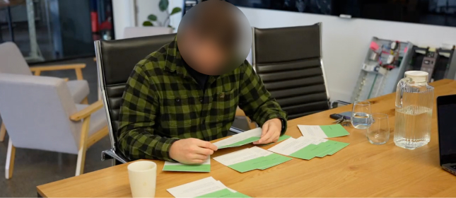
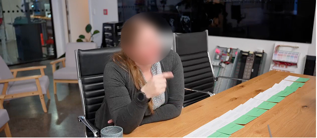
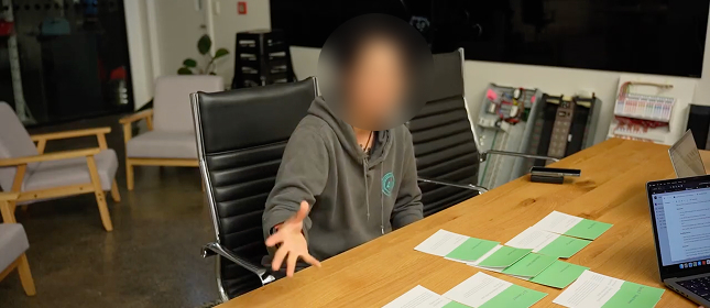
Card sort
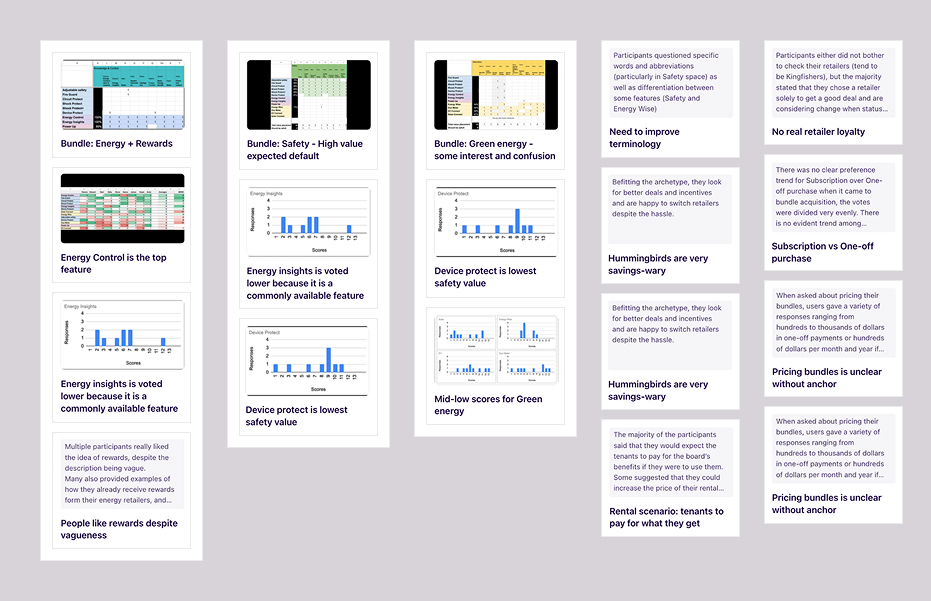
Users prioritised Energy Control over Insights. Safety was treated as a baseline expectation.
Bundling Control and Insights had the most impact together. Safety was already expected — it wasn’t a feature worth leading with.
Design implication
Control first in IA. Insights bundled. Safety ambient, never interruptive.
04
Design brief
Three questions that framed every design decision.
From the research findings, I generated four HMW statements to frame the design space, then translated them directly into testable hypotheses with defined success metrics.
How might we
- Enable users to reduce electricity costs by 15%?
- Turn dense information into actionable pathways, with feedback loops that show tangible, impactful results?
- Increase perceptions of safety, and remove barriers to peace of mind rather than trying to convince people they’re not objectively at risk?
H1
We believe
Communicating energy usage in dollars rather than kilowatt-hours will make data more relatable and actionable for homeowners.
Because
It simplifies energy metrics into a format users can immediately act on.
Success metric
Users who engage with insights 3x/month will show a 10% bill reduction within 6 months.
H2
We believe
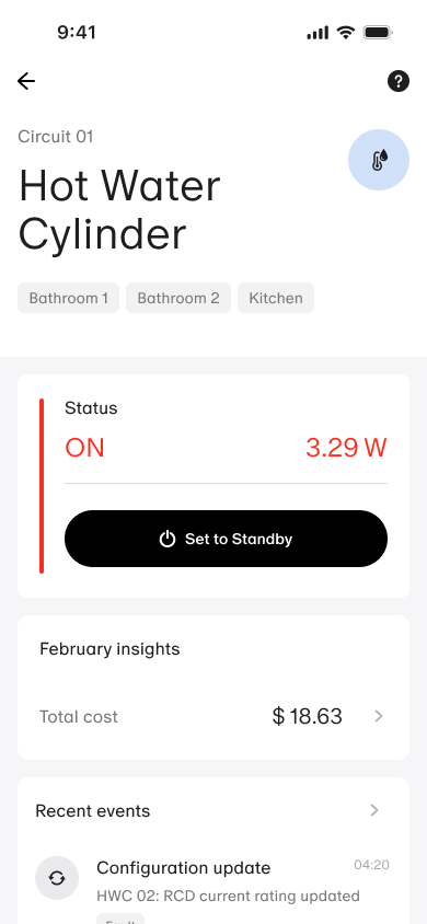
Allowing users to remotely control power in their homes will foster a greater sense of safety and control.
Because
Real-time control reduces unnecessary consumption and mitigates potential safety risks
Success metric
90% of users report feeling more in control of their home’s energy and safety after 3 months.
H2
We believe
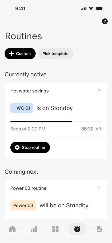
An automation feature that lets users schedule and manage electricity supply will result in a 10–15% reduction in bills.
Because
Strategic power-down during peak pricing hours optimises consumption without requiring ongoing effort.
Success metric
Users who engage with insights 3x/month will show a 10% bill reduction within 6 months.
05
Process
Three paths. One that served both users and the business.
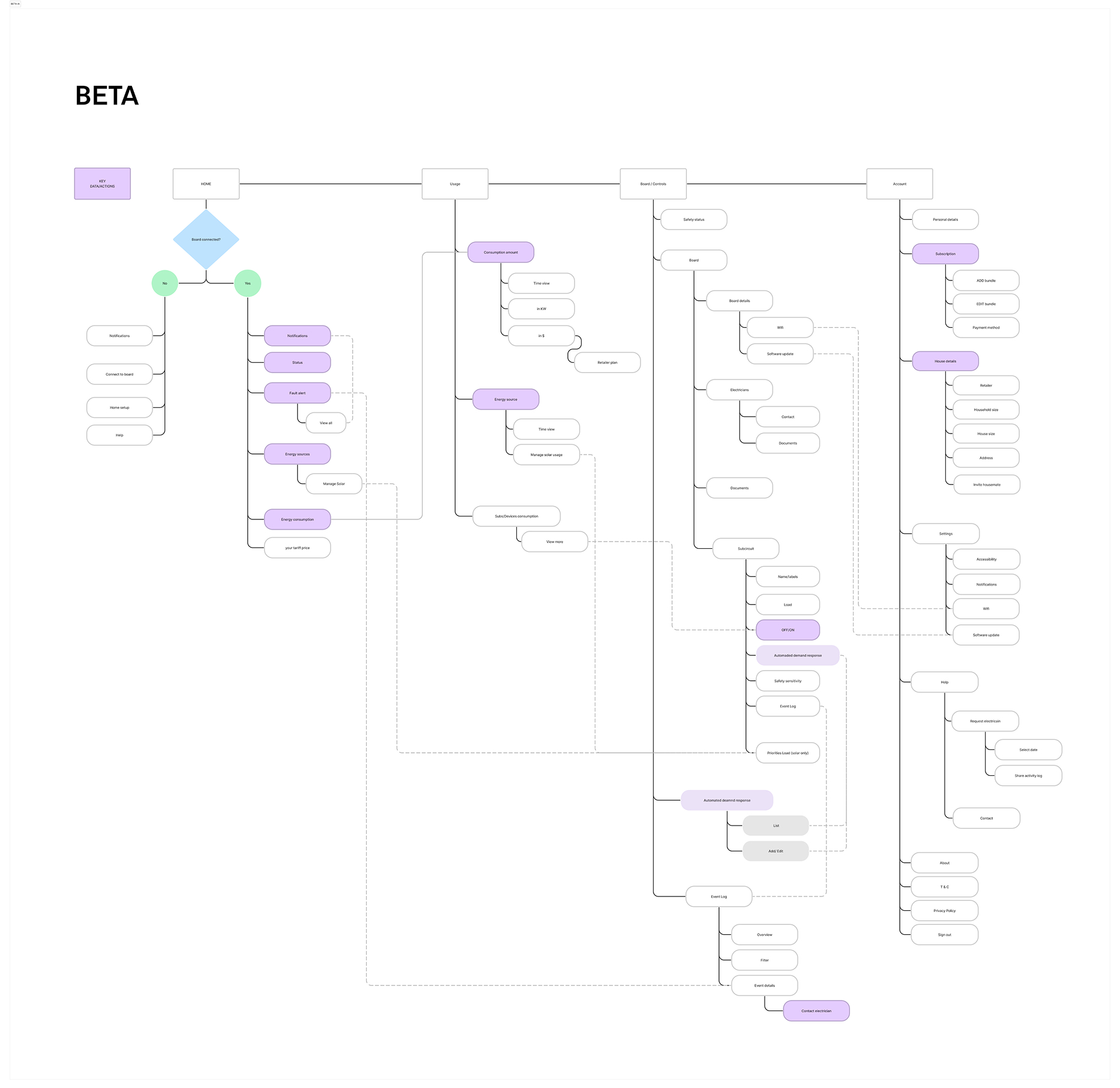
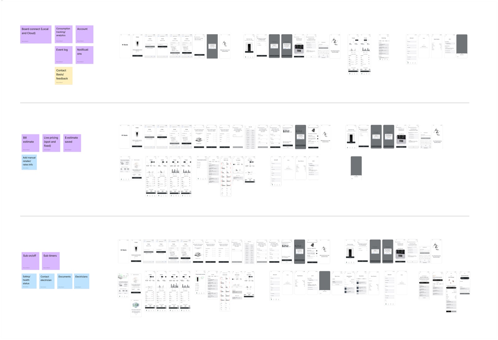
Story mapping revealed a wide feature space with more to build than the timeline and budget could support. I mapped three realistic paths for V1 and made the call based on what the research told us.
Option A
Full control suite
All circuits, routines, events. Maximum power user depth from day one.
Option B
Insights-first
Energy data, cost visibility, recommendations. Passive-friendly but limited engagement hook.
Option C
Paired MVP
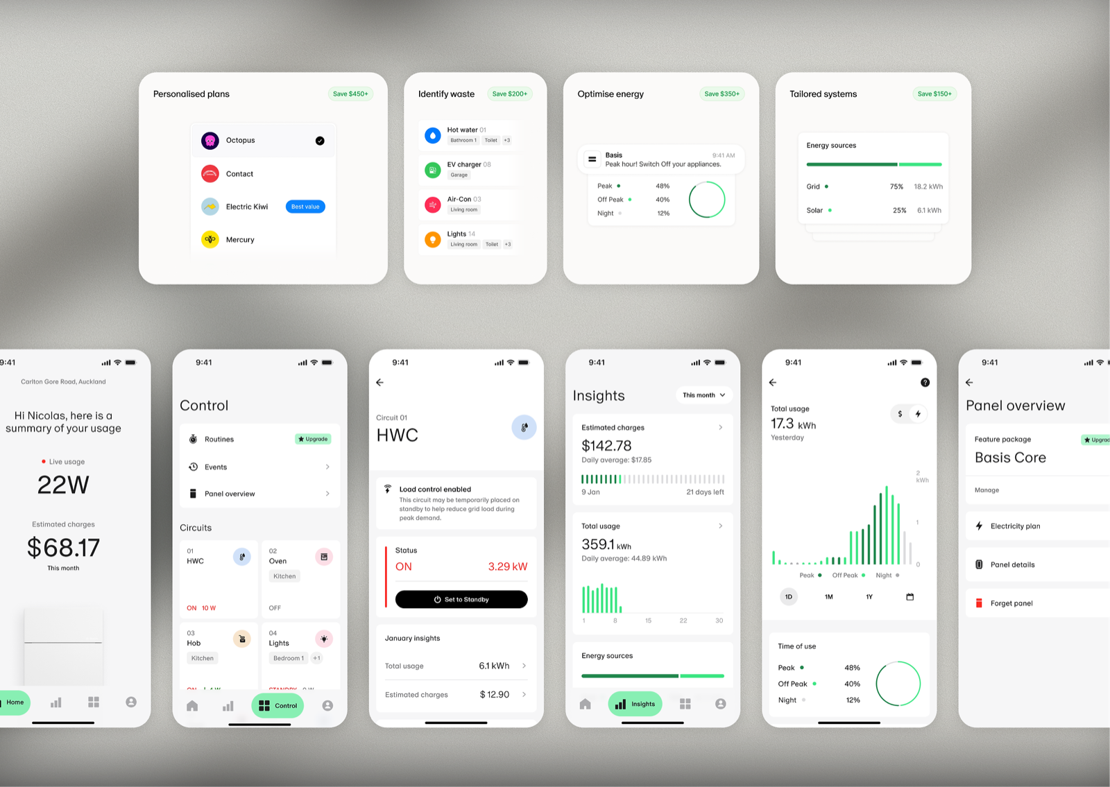
Control + insights bundled, safety ambient. Serves passive users and power users. Business engagement built in.
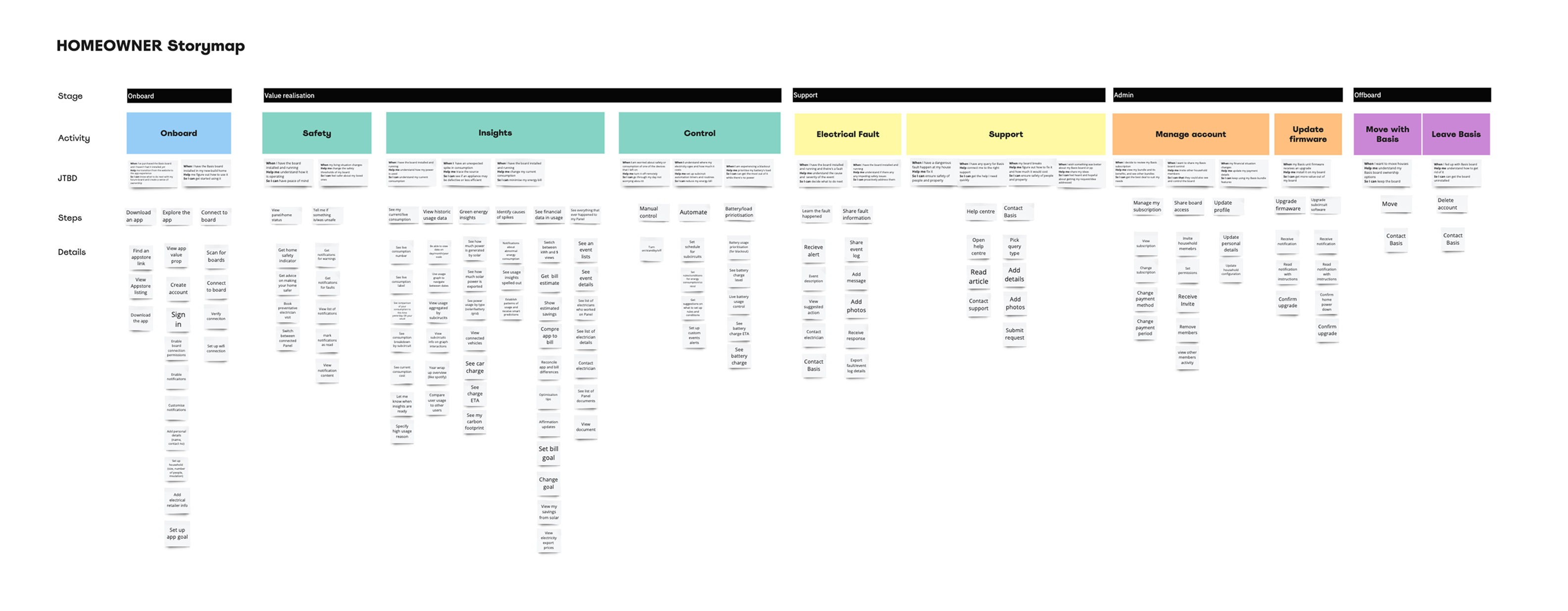
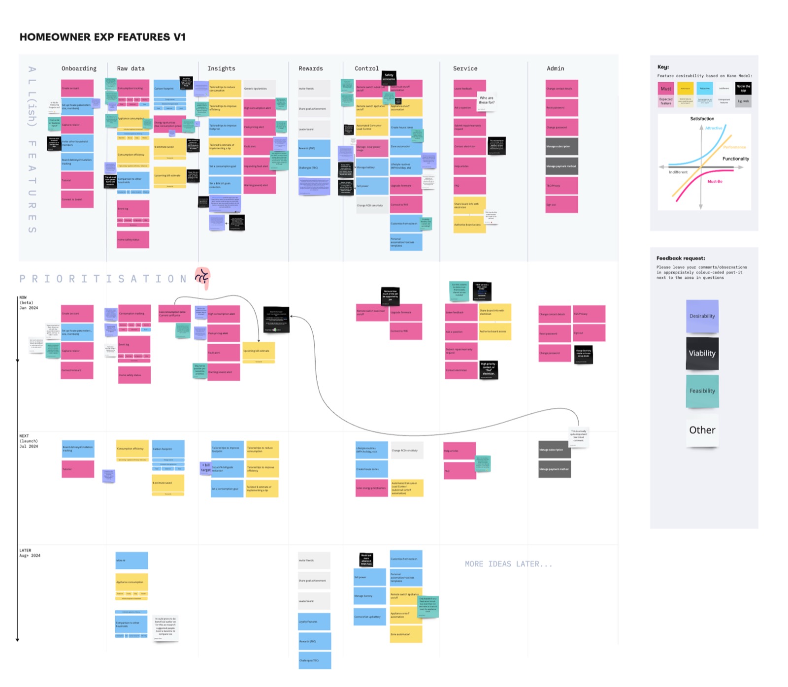
Research said users wanted control. The business needed engagement to support the subscription model. Option C was the only path that answered both — and it mapped directly to the hypotheses we’d already validated.
Deferred to V2
EV charging management
Multi-property support
Green energy features
Advanced analytics
06
Solution design
Three principles that every screen had to pass.
I ran a collaborative Design Studio with the design and development teams to establish direction. Before any screens were signed off, three design principles emerged from the workshop — and every subsequent decision was checked against them.
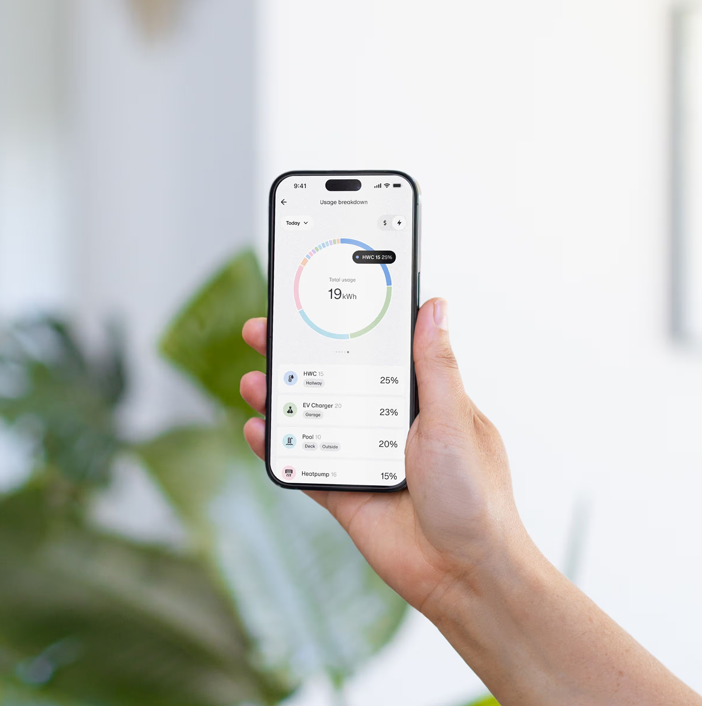
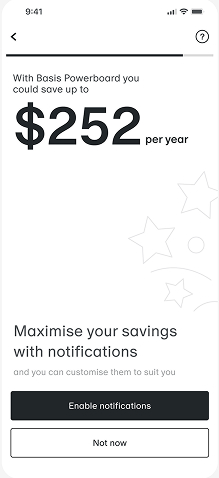
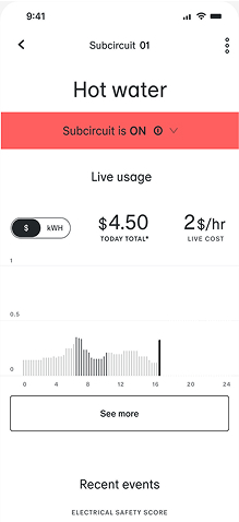
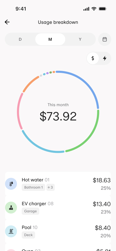
Dollars, not kWh
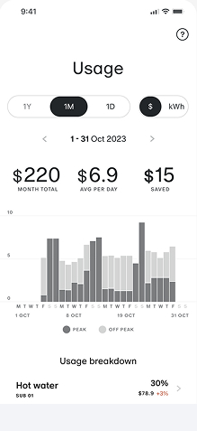
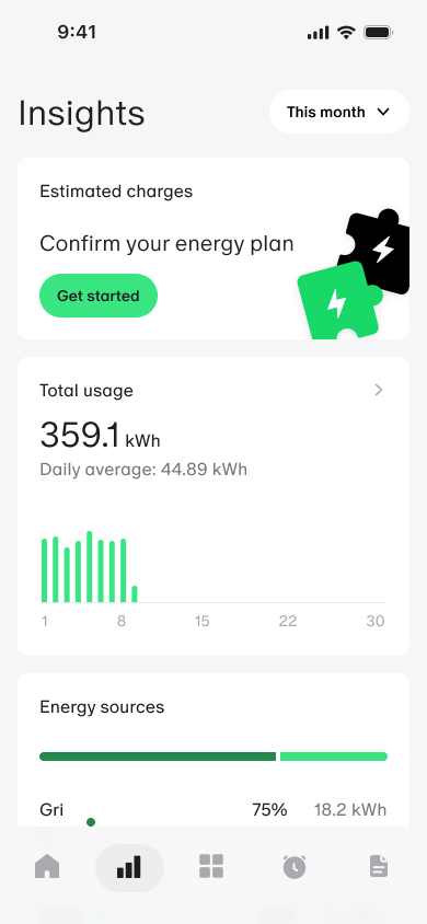
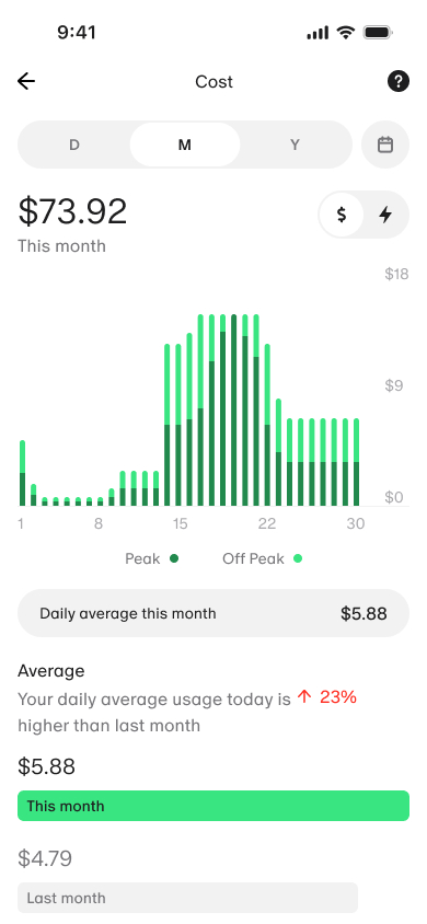
All energy data translated to cost. Actionable by default — no mental conversion required.
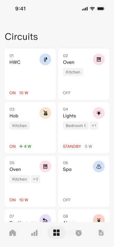
Control before context
Users act first, understand later. Depth is earned through use, not frontloaded at onboarding.
Safety as ambient
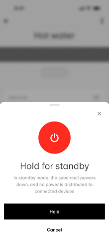
Never interrupt. Always visible. Safety status present in the UI without ever being a primary CTA.
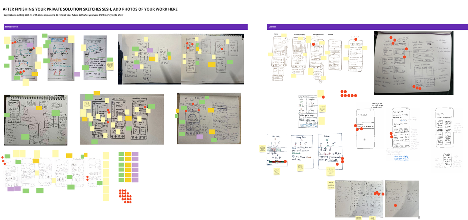
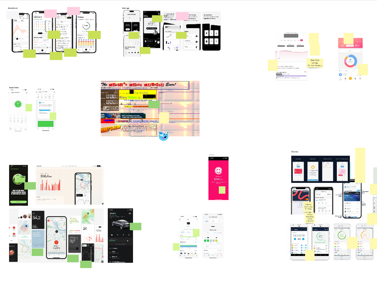
Prototype testing — n=6 · What it validated
Dollars framing worked immediately
Users understood cost impact without explanation. The hypothesis that translating kWh to dollars made data relatable and actionable was confirmed without prompting in the first session.
What broke
Data source confusion
Users couldn’t distinguish estimated from live data. This led to a full redesign of data source labelling and a persistent safety status indicator that followed users across all screens.
07
Outcome
10%
Reduction in household energy bills
Measured over 6-month pilot
85%
Users created an energy routine in week one
Validates automation hypothesis
Closing the loop
Users in the pilot didn’t talk about safety. They talked about savings and control. The product vision held — from the first workshop to the final data point.
Both hypotheses validated within one month of launch. While at the end of my tenure on the project the app rating score doubled.

08
Journey
Research
Heuristic evaluation and baseline usability test across onboarding and in-app BT surfaces. Identified six critical failures.
Align
Product goal workshop with founders and leadership. Established the vision before any research began.
Discover
HMW statements, hypotheses with success metrics, story mapping, V1 prioritisation.
Design
Design Studio workshop, IA, core flows, prototype testing with 6 participants, two rounds of iteration.
Build & Pilot
Dual-track agile delivery. Compliance testing pilot. Outcomes measured against original hypotheses.